Lounge
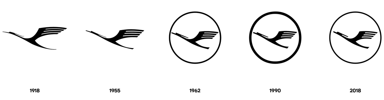
what has happened to the 'fried egg'?
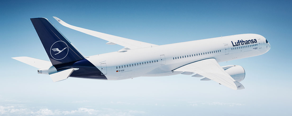
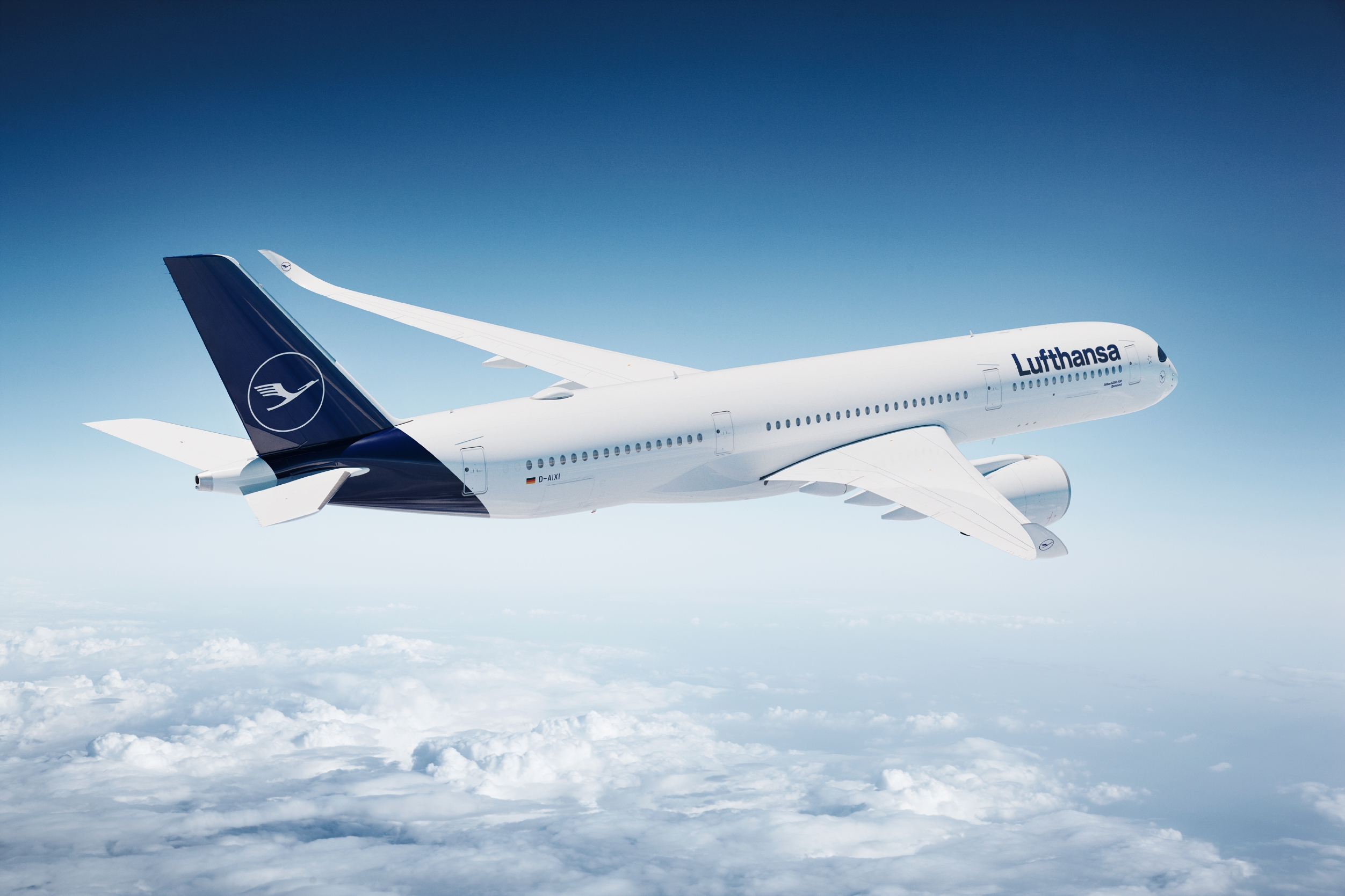
After 30 years, Lufthansa has taken on a new look. The most marked change: the yellow circle on the tail fin – which was sometimes likened to a fried egg – has disappeared, and the crane symbol now appears on a darker blue background.
Color scheme
The blue/yellow color combination will remain in use. However, the use of these primary colors has been redefined – the blue is a little darker, more high-class, and will become the leading brand color. The yellow will be reduced in quantity but, in terms of quality, it is being upgraded and can therefore serve to a greater extent as a means of orientation – whether it is used at the airport or in the aircraft itself.
100 years of the crane symbol
In 1918, the graphic designer and architect Otto Firle designed a stylised bird for the “Deutsche Luft-Reederei”, a predecessor airline of Luft Hansa. Over the past 100 years, the crane has become the unmistakable symbol of the Lufthansa brand – and Germany's ambassador across the whole world.
Lufthansa designer Ronald Wild talks about the timeless crane logo and how hard it is to draw a u.
Mr. Wild, what is it that makes the crane such an iconic emblem?
It’s a beautiful image of a bird, graphically simplified but nevertheless full of grace. You can see that it was drawn by hand rather than on a computer. In 1962, Otl Aicher placed it inside a circle, a basic geometric shape that made it memorable and turned it into a logo.
The Lufthansa emblem is a design classic, but the airline is currently revamping its image…
The corporate identity of a long-established company has to be timeless. Simultaneously, and this is where the challenge lies, it has to suit its contemporary surroundings. Everything has changed: the world, our society, the media – and Lufthansa has naturally changed as well. That’s why we’re not just modernizing our image. We’re modernizing the entire brand.
What a huge endeavor. Why now?
Because this year, the crane emblem celebrates its centenary! It was the perfect time to ask ourselves: What does Lufthansa really look like now? Not in the design handbooks but out there at the airports. During this time, we tried out many variations. Like a building that grows when you keep adding to it, each modification is an improvement but lacks overall clarity and homogeneity. We hadn’t changed the logo, typeface and colors in 30 years, and now we’re tying up all the loose ends.
What were the most important visible changes you made?
The crane emblem is now lighter and more dynamic. The new blue is the dominant color; it’s an elegant hue with lots of depth. The typeface has remained timeless, functional and easy to read, but it now has an unmistakable character of its own. Some of the changes are obvious, others are more subtle. But seen as a whole, the way the different design elements interact is a huge step forward.
One of the most difficult tasks you faced was developing a new corporate typeface. What were some of the considerations?
It had to suit Lufthansa. At one point, we all fell in love with a variation of the letter U without a spur, but when we spelled the words menu or Honolulu we soon realized that it didn’t have enough weight. A typeface has to be suitable everywhere, from the aircraft logo to the tiny details on a boarding card. This is more difficult than you might think. The overall effect of a typeface is subtle but crucial. It’s not the lead singer of a rock band.
That would be the crane?
Yes, it should stand out more … (he laughs). But actually, there are no soloists, it’s more like a well-rehearsed ensemble.
What happened to the color yellow? Is the “fried egg” on the tail a thing of the past?
That particular decision was not easy, but after a lot of thought, we took it. Good design requires a dominant color and the new blue we specially developed reflects Lufthansa’s image as a premium airline just perfectly. We are reducing the amount of yellow over all but we are improving the quality. Yellow remains very close to our hearts.
How long will it be before every Lufthansa aircraft sports the new look?
That will take a few years. Every plane will be repainted when necessary from a technical perspective. There are about 700 items in the cabin alone! Take the coat hangers, for instance: We’ll be leaving the old logo on them until they break and have to be replaced. We want to proceed as responsibly as possible in economic terms, too.
Your team spent many years re-imagining the brand. What was the biggest struggle?
Letting go! The only thing that helped was to give myself time. I took the designs home with me, hung them up in my kitchen and allowed them to act on me. Some people will undoubtedly regard the new design as too radical and others will say it isn’t radical enough. But we developed it for all the true Lufthansa fans out there.
Further content on the topic
Video
Redesinging Lufthansa
Making of
The new look of the A350